 I got a comment from David that I’d like to highlight and address, because I believe it highlights a misconception folks have about pixel art and the style of my games. I’ll cut the comment for length, but try to retain the intent.
I’m a visual artist, so critiquing your visuals is all I feel arrogant enough to do. They were well executed and suited their purpose in “Bars of Black and White” and in Exploit (and in the “Majesty of Colors” they were exquisite), but in “Sugarcore” and “How to Raise a Dragon” they cause the games to suffer. In “How to Raise a Dragon”, the pixels are not a bad idea, but they are also sort of sloppy looking. They are used in lieu of more detailed graphics to avoid having to draw, right? They are probably better than the alternative, but the use of pixels should not become your crutch. Instead it should be used to artistic effect.
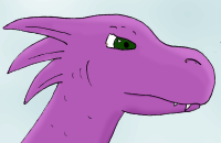
The art style in “Dragon” was definitely chosen for artistic effect, not to avoid making art. “Dragon” has this art style for much the same reason as “Majesty;” they’re both evoking simple, innocent emotions that resonate with the nostalgic emotions brought up by lo-fi art like this. “Dragon” is at its heart a let’s-pretend storybook game. What if you were a dragon? No, Daddy, the dragon should be nice to the people! Thus, the childish feel of the blocky pixels helps to generate this feeling.
The foreground pixels are always the same size relative to the viewpoint of the game (4x), while the background layers are multiples of this. The dragon, on the other hand, gets progressively larger throughout the game, starting at 40×20, then 40×40, then 55×55, then over 80×80. Meanwhile, the background reduces in scale. In the Hatchling stage, 40 pixels is about two or three feet, and in the Adult/Elder stages 2 pixels represent the same distance. Therefore, the increasing size of the dragon is represented in two ways: the background is smaller-scale, and the dragon is larger on the screen.I appreciate the layered backgrounds and distance having larger pixels and thus being less clear, but the contrast between large and small pixels could be used to greater effect to promote the hugeness of the dragon and the feeling of getting larger. The beginning might feature very large pixels which get smaller with each stage. The dragon would start simple, and become more detailed (and more impressive) as it grows, and people could be kept a consistent size and shape, which would prevent the discontinuity between the look of the wizard at the end of the first stage and the villagers in the last stage. This sort of happens when moving from Adult stage to Hero stage, when the dragon becomes larger and more detailed, and it works! Which makes me wish that it happened for the rest of the game.
If I had done as David suggests, and started with large pixels and made them smaller, I think it would have a conflicting effect. Big pixels say “large scale.” Highly detailed objects feel smaller than big blocky objects, in part because their building blocks occupy more screen space. Additionally, as long as we’re sticking with power-of-two scaling of pixels (to keep pixel boundaries crisp), the scaling wouldn’t really work; a human who is, say, 48 screen-pixels tall at the Adult stage (their current size) would need to have those pixels be 8×8 in order to fill the screen, and a sprite that reads right at 1×1 won’t read right at 8×8. I also think it would be disorienting for the foreground resolution to change throughout the game.
 I’m a decently experienced cartoonist, although I have no formal art training. If I had wanted less blocky art for “Dragon,” I could have. My cartooning isn’t professional-level, by any means, but I could have used a less blocky style for “Dragon” without much more effort. Pixel art on the scale used in Dragon isn’t easy! It’s certainly quite a bit harder than “Majesty’s” simpler art. Many folks assume that pixel art (in indie games especially) is chosen out of laziness or kitsch. But good pixel art takes a lot of work, and there are real motivations behind the choice to use it. Now, the pixel art in “Dragon” isn’t the best, as I’m still learning to use the medium. But it serves the purpose, I think.
The comment didn’t offend me; I just thought it was a good springboard to use to talk about this issue. Thanks for the comments, David.
Cool. But I disagree!
(I apologize for the fuzziness of this picture. It’s hard to find a freeware, OSX, pixel-drawing program without a few bugs.)
http://farm3.static.flickr.com/2479/3714009833_1775d59103_o.jpg
Here I drew some different resolutions of how the dragon might look as he grows (4, 8, 12, and 16 screen pixels per game pixel), to see what I could learn. There are a lot of problems with these versions as far as playability, but I think it’s a useful diagram for what we’re discussing.
While you’re right, I didn’t think about the fact that a smaller resolution makes things look blockier, bulgier, and heftier, I think I was right about the feeling that this gives the object. It’s like legos. The smaller and more complex legos are for older children, and the huge Duplo blocks are for toddlers. The dragon with fewer pixels is way more adorable because he’s so simple, while the older dragon can be more detailed and impressive. And as long as there’s a person in each stage, then there is a point of reference for the player to identify how much he’s grown, and this effect will overrule the feeling of smaller pixels you brought up; our components won’t have gotten smaller, the camera will have just had to zoom out because we got so huge. My huge pixel stage has a questionable playability… but I think it would work?
The scale I used is all wrong, though. I tried to reduce the radical change of the size of the pixels by stepping down in a ratio of 4:3:2:1 instead of powers of two, 8:4:2:1. It doesn’t work, because my dragon-to-person scale is all wrong. The dragon in my illustration starts out larger than in your game (but works), ends way too small (doesn’t work), and in the adult stage is still shorter than a person (doesn’t work). These are attempts which try to keep the dragon sprite about the same the whole game (except the last one; I got a little carried away), but if you don’t mind the dragon taking up more of the screen as he grows, then the problems are solved, and you can maintain the scale in the game as it is now.
Your thoughts?
That actually reads fine, but I’m concerned about the detail of the rest of the game at that resolution. Hatchling food items would be made of about 2 px, and thus unrecognizable, or else be bigger than the dragon’s body. You’d have to sacrifice the particle effects that help identify the edible items, because the particles would look bizarre at a higher resolution than the foreground elements. The backgrounds, on the other hand, would need to be much lower in detail for most of the game, and the tutorial text would need to be much larger to avoid clashing with the resolution of the foreground objects. And I don’t know if I’d want to try getting away with a book screen that was at a vastly higher resolution than the game proper. Additionally, it would be much harder to animate the dragon’s actions intelligibly at the low resolution you have for the hatchling and adolescent.
That approach could work for a game, but I think it would require enough design changes that the game wouldn’t be “Dragon” anymore.
Looking at David’s example, I really understand what he is saying. The simpler dragons do seem inherently more childish. If you are worried about detail levels for other sprites, the smallest dragon in David’s example might simply be going too far. It is little more than a lizard, probably more suited to food than being a dragon. From the second dragon on, he has all the detail you would need for any dragon behavior animations. You really had more detail than you were using in the sprites in the game anyway.
When I was playing through, I found I was dissatisfied with the look of the dragon in every stage before hero. It is only now, looking closer at the art, that I realize it was a result of the way he moves (noting that he barely moves in hero). The dragon has all this detail that is not doing anything. He walks, and naught moves but his legs. He spews forth flame from his great maw without so much as flexing a neck muscle. He makes great jumps, his legs dangle below him like cement weights. He soars through the sky and his wings do not so much as twitch. I feel like you spent all this effort getting the shape just right and not enough effort animating it. His head should have been bobbing, his tail should have been waving. Even a suggestion of a shape is sufficient if he moves right. Super Mario World stars a hero who in his default state is a mere 16 pixels tall, yet he is identifiable as a man, and moves dynamically with his entire body, so it works out fine.
Static pixel art is harder than people give it credit for, but it pales in comparison to the difficulty of pixel animation. And you MUST get the look right for the player sprite. Everything else takes a back seat, because nothing else will be stared at so long or so hard as your little man. In Majesty of Colors, the “hero sprite” was essentially a tentacle, and its motion was BRILLIANT. The dragon was just meh, and I suspect THAT is why people would think the art looks lazy.
On a more philosophical note, it strikes me as just fine if the dragon’s food seems huge in comparison to him. He is a growing dragon, after all. om nom nom.
Totally unrelated, but Weir you gotta check this out.
http://firstmillionsketches.tumblr.com/post/138207640/i-fell-in-love-with-the-majesty-of-colors
I played the game and I LOVED it!!!! Please make a pixel sequel! I could have more features but less things to unlock.
Sorry I meant IT could have more features, not I.
I love pixel art and I don’t think it’s something you’d choose out of laziness, but looking at David’s concept art, I actually like it a lot better than the existing How to Raise a Dragon Art! :p I really like the way it transforms. I’m a sucker for chunky pixels, I guess.
Phillip Meiser has a very insightful point, about animation. On Game Design Scrapbook, Krystian Majewski talks about the importance of animation, especially secondary animation, in the feel of a game and I definitely think that’s an area that could have been elaborated to great effect in How to Raise a Dragon. I’ve linked to the article – click my name to read it.
It is too bad I didn’t find this game sooner, but there is one single inconsistancy that I feel really deserves to be fixed:
If the hero dies to a necromantic dragon, should they really die?
It would be somewhat of a neat easter egg, a variance in the final ending, to have the hero rise as a zombie and possibly a text mention.
Ah, good idea. I have to admit that I never even thought of that.